Elements of a High Quality Landing Page

As we all do increasingly more business online, it becomes necessary to have a good high quality landing page for each service we offer or product we sell. Yet, particularly in Japan, I see so many poor landing pages. These landing pages fail to garner users’ attention and fail to convert visitors into customers. Many businesses don’t realize that they are losing customers every day.
What is a Landing Page?
In short, a landing page is the first page visitors see when they “land” on your site.
Visitors can come from a number of different places different places.
- Direct: Maybe the user heard about your website, or have your business card, so they typed your address directly into their browser.
- Search: Maybe the user performed a search on Google or some other search engine, then saw your website listing, and clicked on it to land on your site.
- Referrals: A user may have been referred to your site via a 3rd party site. Some examples are directory listings, (yellow pages), social or other people’s blogs.
- Social Mentions: Mentions or shares on Social Networks like Facebook, Twitter, Instagram, Line and more.
- Paid Advertising: Advertising can be from search listings, or on display ads you see on common sites like CNN.com. Advertising on Social Networks is now popular as well.
The key point is, when a user visits your site for the first time, they probably have some mild idea (or an inkling) of what your service can do, but they may not be sure. As an online marketer, your goals is to empathize with the user’s problem, and provide a solution that they are interested in, then get them to take the next step.
There is a common fallacy that the landing page MUST be the home page of your site. In most cases, that is not true. If your website site sells a single point product, or solves one particular problem, then treating your home page as the landing page is probably OK. But if you have multiple products or services, then it’s best to have 1 landing page per service. Then you can focus on the user’s exact needs.
Need help with creating landing pages? We can HELP.
What’s At Stake?
What’s at State here? Well, your entire online business. Execute it poorly, and you may have no online business at all.
You have just 3 to 5 seconds to describe a problem that resonates with your audience, describe how your service is the right solution, then convince them to take the next action. Yes, you need to do all that in a matter of seconds. Web users these days (especially the younger set) are very impatient. They will quickly scan your page, and decide whether it’s worth their time.
In that 3 to 5 seconds of time, users will glance at the following:
- Title
- Subheading
- Main Image
- “Call-to-Action” Button
That’s it. Each of these 4 elements is vitally important in convincing the user to stay on your page and continue on their “journey” on your website. So for the rest of this blog post, I will focus on these four main aspects.
WIIFM?
The initials stand for “What’s In It Form Me“. That is the secret voice inside the user’s head when they visit your site for the first time. Your landing page needs to convince them that your service or product will solve THEIR problem, or perhaps make THEIR life better. Not the other way around.
So with that in mind, let’s take a look at the 4 elements mentioned above, and discuss some best practices.
#1 Clear Effective Title
Your landing page needs to have a clear effective title. In a few short words, the title should clearly convey the name of your product, and what it can do. The Title also needs to have “keywords” in it, so that you can make it easy for Google to find you.
Let’s take a look at what Visual Website Optimizer (VWO) has for a title.
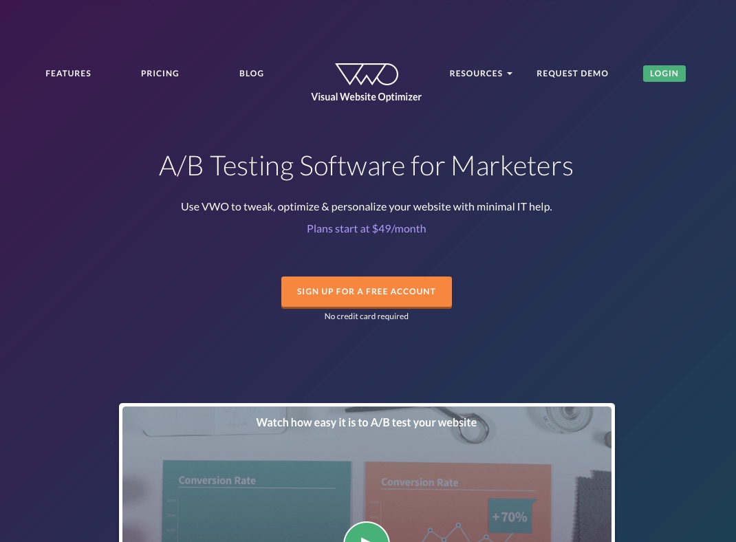
The state “A/B Testing Software for Marketers”. That pretty good. If I open up Google and search for “AB Testing Software Marketing”, there is going to be a good match. It is nice to see those keywords in the Title. Google will reward you for that. I also like the “for Marketers” part too. It quickly answers the question of who this product is for.
The only improvement I might make is to but some spin word like “The Best A/B Testing Software for Marketers”, or “Advanced”.
#2 Sub-Heading Text that Makes a Promise
In your subheading text, you need to not only show empathy for the user’s problem, but also present why your service or product is a viable solution to the user’s problem.
Let’s take a look at how Moz.com handles this challenge.
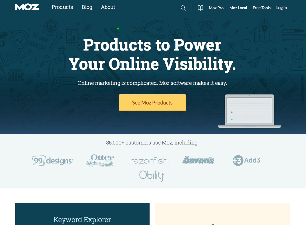
Their headline reads “Products to Power your Online Visibility”. That’s good. But what I really like is their followup headline: “Online marketing is complicated. Moz software makes it easy.” Just brilliant. In 2 short sentences, I, as the visitor, feel that Moz has resonated with my problem (marketing SW is complicated), and offered a solution (Moz products). Wow! Just what I need. I can’t help but want to find out more.
#3 A High-Quality Image
Pictures are much more powerful than words. Choose a great picture that represents your brand is the utmost importance. Yet, for most small businesses, it’s amazing how little time is spent on choosing the right image to describe our services.
Let’s take a look at the powerful ride-sharing service Uber.com has for an image.
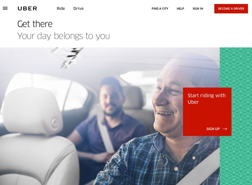
Here is what I see in this image.
- A man, who looks like a retired professor, driving a car. He is smiling. Would you trust this man to drive you home? Yes.
- The passenger looks like young male professional, he looks satisfied.
- The car looks brand new, neat and clean. It also looks like it has leather seats. I can practically smell the new car smell. Would you want to ride in this car? Absolutely!
- It also looks like the drive and passenger are having a friendly conversation. It leads me to believe that Uber perhaps offers something more than just a standard cab ride.
Well done Uber.
#4 A Clear Call-to-Action Button
Many websites do so well on the other 3 elements and then blow it on the Call-to-Action button (CTA). The CTA button should be the next step you want to take on their journey through your buying process.
There are a couple of points to make
- The CTA Button should be displayed clearly on the top part of the page (above the fold)
- The CTA Button should be in a color that makes it stand out from the background colors. Colors like orange, bright green, and bright red have tested well.
- The CTA Button text should be really clear. It should tell the user what the next step will be in their customer journey.
- Many first-time internet marketers name their button “Buy Now”, in hopes that the visitor will read the headline, look at the beautiful picture, and want to buy. It might work for a $10 item. But definitely, won’t work if you are trying to sell them a service that costs thousands of dollars per year. In most cases, you will need to warm the customer up with a series of baby steps.
- So make that first step something simple, free and easy that the user will get a lot of benefit from. Things like a “Free Report”, “Free checklist”, “Free online course” all convert very well.
Let take a look at how Thrive Themes handles their Landing Page. (BTW, we at JC Digital are big fans of Thrive Themes, we recommend them for WordPress themes and tools).
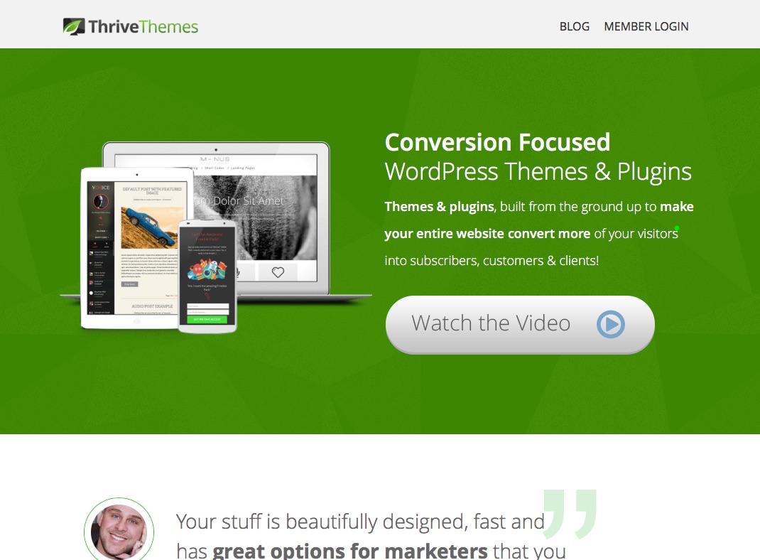
A couple of things to note.
- Normally I would not choose off-white for a CTA Button color. But when put against the green background, that button really stands out.
- The button is nice and big, easy to see.
- The text “Watch the Video” is really clear. To re-enforce it, they put a video-play icon in the button. Nice.
- But best of all, the video that plays after you click the is really powerful. They know that if they can get the user engaged with that video, that they have a high chance to make a sale. Notice they are not asking the user for money get.
Elements to Avoid
So we talked about the 4 key elements to a good landing page. Next, I want to briefly discuss some elements that NOT needed in a landing page. The elements below will distract users from reaching your goals. Even though they are not needed, I see them on many websites in Japan. In each case, they violate the “What’s-In-It-For-Me” Test.
- News or PR Items – Does the user really care about PR events that you think are important?
- Company Vision Statements – Have a company vision statement is great. Values are important. But if the user is giving you the 5-second glance, do you want to waste their time with Vision Statements?
- Message from the CEO – Does a first-time visit know or care who your CEO is? Do they care what he has to say? No. Users care about whether your service can solve their problem.
- Company Profile – Notice that none of the model websites above talked about their company profile at the top of the page. If a user wants to know about a company, they can find the “About Us” page later, after you have convinced them to take the next action.
- Capital, or Investors Information – Users don’t care about your company financial information, they want to know if your service solves their problem.
Summary
So there you have it. 4 Elements to focus on when designing and building your landing pages. Along with some elements to avoid so you don’t make a mistake. Having the right landing page alone, won’t solve all your online problems. But it is an excellent step toward getting more customers online.
Need help with SEO services in Japanese or English? Visit our SEO Page.
About the Author Jeff Crawford
Jeff Crawford is a Digital Marketing expert, technologist and Manager. He has worked for technology companies in Silicon Valley such as Apple, WebTV and Microsoft. He has lived in Tokyo Japan since 2004, working for companies such as Microsoft KK and Adobe Systems Japan. Jeff is founder of Zo Digital Japan, an SEO and Digital Marketing agency based in Tokyo. Jeff started the Tokyo Digital Marketers Meetup in 2016, which now has over 2000 members. He has also presented about Digital Marketing at such events as Ad-Tech Tokyo, WordCamp Tokyo, Japan Market Expansion Competition (JMEC), and the Japan Association of Translators (JAT).